Product design & engineering has a habit of concentrating on processes, machinery, and details. But what about colour? We thought it was about time to explain a little bit about how we can use colour in our products.
Designers and marketing professionals have been guiding us with colour for a very long time – should you do the same with your customers, too?
There are many opportunities to pick colour schemes; it’s going to be one of the first decisions that small business owners need to make and it will keep reoccurring as we think about redesigning our interiors, decorating and designing new promotions.
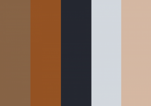
We know that colour invokes an emotional response, which is why we care so much about it. We also know that colour theory and psychology of colour can be a profession in itself, which gives us a chance to delve a little deeper. As most of our products are wooden, we naturally promote the hues of wood; browns, mocha and mushroom… however we’re able to finish wood in a bespoke manner too. Whitewashing and coloured paints can be used to create the perfect product even before the signage or poster is considered.
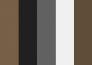
Majisign’s “slatted” & “yellow menu” palettes; hues you’ll find in our woods & finishes!
There’s no doubt that consumers identify with a brand through colour. Our colour choices may be as simple as picking our favourite colours or basing them on our target audience and the way in which we want them to feel. But where to start?
- Should I pick warm or cool colours?
- Are dull hues with a single neon accent colour a good idea?
- Shall I use a recent dining experience as a good start?
- Which colours promote luxury, relaxation, hunger, thirstiness etc?
Here is a selection of Majisign’s palettes that we’ve recently used in some of our products.
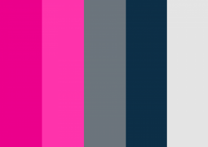
Majisign “Hot Pinks” – for our website
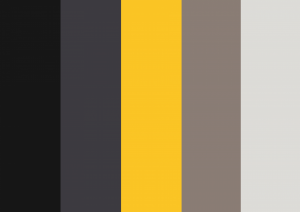
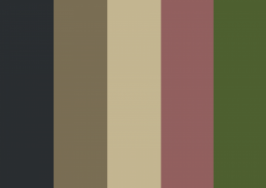
“Basic Chalk” – found in our framed chalkboards and easels
When considering how colours are perceived, it can be much like reading ones star sign for the week. White is often cited as “clean, pure, light” whilst red is bound to attract warnings, hazards and other such threats. And whilst this may be true, there are huge brands that use colours that on paper, at least, would be the last choice! Take red for example; Coca-Cola and Royal Mail are 2 of the largest brands seen in the UK and they both use red, which should mean “danger, stay away!” however red also promotes excitement and “look at me”. Ultimately each colour is interpreted differently by different people.
What we do know is that whatever colour palette you decide upon using, it needs to be something that you and your colleagues prefer and is deemed attractive by your customers or audience.
Despite all of this effort, it’s clear that how we reproduce this colour is incredibly important. This is one of Majisign’s strengths.
Did you know that most computer monitors and smartphone screen are incorrectly calibrated or incapable of real-life colour representation? Even this web page’s colours will look different between devices. It’s this variation that we must avoid when printing. There’s an easy way to combat this and we do so through the “CMYK colour system”. Ultimately this means that any colour created will be faithfully reproduced by our printers. Majisign uses a 5 colour system, which means we use CMYKW, where the “W” means “white”. Unlike domestic and other forms of printing, we need to use white ink. Not only does this give us a greater palette to work from, it means we can print pure white onto chalkboards! Very handy indeed.
Here is some more inspiration:
“Pub Grub” – taken from our Standard Plus Wooden A-Board
We love colour and creating beautiful products so much that we want to provide the best possible printing services to our customers.
Our printers can achieve amazing print speeds up to 60 square meters an hour. That’s about 15 kingsize beds! But it’s not all about size. Even when we are printing huge works of art, our machines can print right down to tiny sized font- 2pt! That’s small but you can still read it. We can print onto acrylics, polycarbonates, PVC, glass, aluminium, metal, polyesters, foam board, styrene, stone and of course wood!
Visit our shop for more ideas or